Following Nicolas Nova’s wrap-up regarding the ethnographic research about Cloud Computing which came to an end last April (publication to come) in the frame of Inhabiting and Interfacing the Cloud(s) (I&IC) and learning from it, it is also time for me to write a midterm status report about the design aspects of this ongoing work. It is the occasion to resume what we’ve been through along the process and highlight the most important elements.
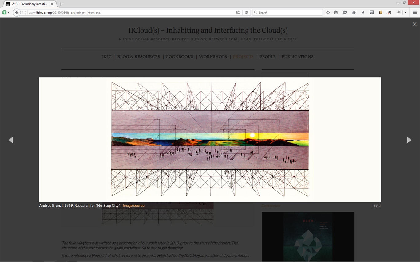
“No-Stop City” (A. Branzi, 1969) used as an illustration in the founding document of the I&IC design research.
Image retrieved from the post “I&IC Preliminary Intentions” (05.09.2014).
We are therefore trying to put in evidence in this article what we’ve learned so far during the process and where this might lead us as design strategies during the last year of this design study. This while knowing that our plans are to produce design artifacts and functional prototypes as results of this research process — among other ones (books, tools, etc.)
As a reminder about the premises of this interdisciplinary design research, a paper was written and uploaded on this documentation blog at the start of the project back in September 2014. It pointed out big “gaps” between the experience as well as the communication of the cloud service from an end-user perspective on the one side and the centralizing nature of its stacked infrastructure on the other one.
This document resumed and framed at the time the questions we addressed to the technological setup commonly known as “The Cloud”, what we planned to realize through our design-research: coming up with design “counter-proposals” to what was questioned as a very functional, engineered and centralized apparatus (points that are explained with more details in the founding document).
As a matter of fact, we insisted in this paper about the interdisciplinary aspects of our research, considering that “The Cloud” couldn’t be addressed without taking into account several disciplines: 1° an ethnographic dimension (usages study), 2° an interaction design one (interfaces, interaction) and 3° an architectural one as well (infrastructures, territorial presence).
Yet, we deliberately chose to give less importance to the engineering thinking during our process, precisely to be able to come up with “alternatives” articulated around design approaches. This in the context of a research debate on the field largely dominated by scientific discourses.
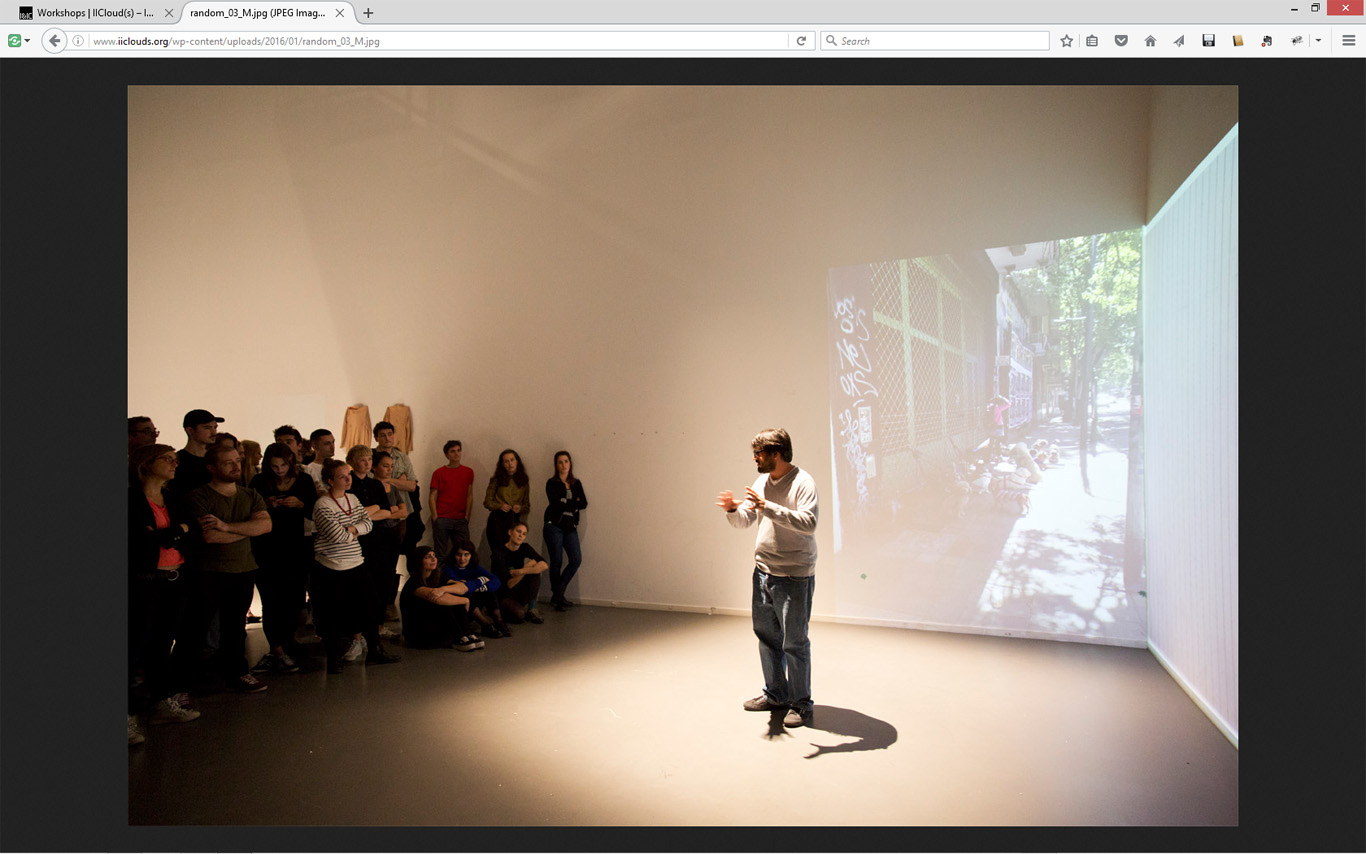
Dev Joshi from Random International talking to the students about “Ghost Data Interfaces” at the end of a week of workshop with them.
Image pulled from the post “I&IC workshop #5 with random International” (23.11.2015)
The foundation document for I&IC described precisely several thematic workshops we planned to organize with the participation of peers. The purpose of these workshops was to act as an equivalent to the “sketch phase” during a design process, a part of the work that could naturally involve peer partners. This phase could also implicate design students – under the research leaders’ supervision -, so to enable us an increase of “quantity” in our design “trials and errors” (sketch phase, iterative). The sorting process of this phase’s results and this “quantity” remaining logically the responsibility of the narrowed research team, following criteria that responds to our research questions and the preliminary findings of the ethnographic field study.
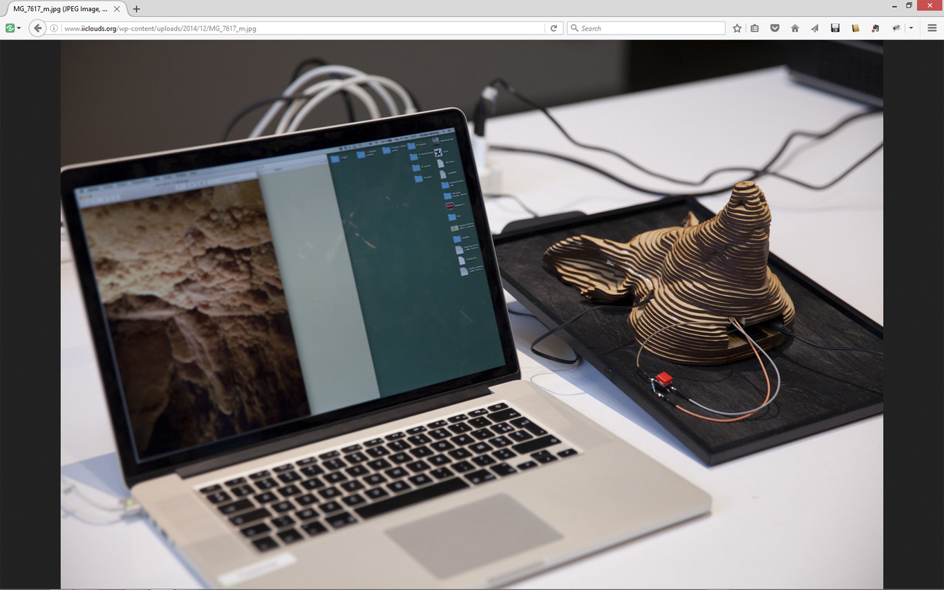
Along the way, to bring technical support during the workshops process and to set up our own distributed platform to work collaboratively, we’ve identified cloud platforms (hardware, software) and chose the one that fitted the most, OwnCloud, to work with or to extend (development of libraries dedicated mainly to designers). Doing so, we’ve already outlined some of our final deliverables: tools, methods and artifacts for designers and makers to help democratize the technology and develop projects. We’ve thus became at the same time our very first “users” to observe.
Following this line of thinking, we’ve also noted that there was a big potential to transform and improve the design of the standard 19″ computer cabinet based on the “U” rack unit, so to address a broader base of uses that would match some of our objectives: this would help move the very formal 19″ computers cabinet out of his “closet”… (out of a “technical only” use, make it somehow more “domestic” and therefore necessarily more physically distributed).
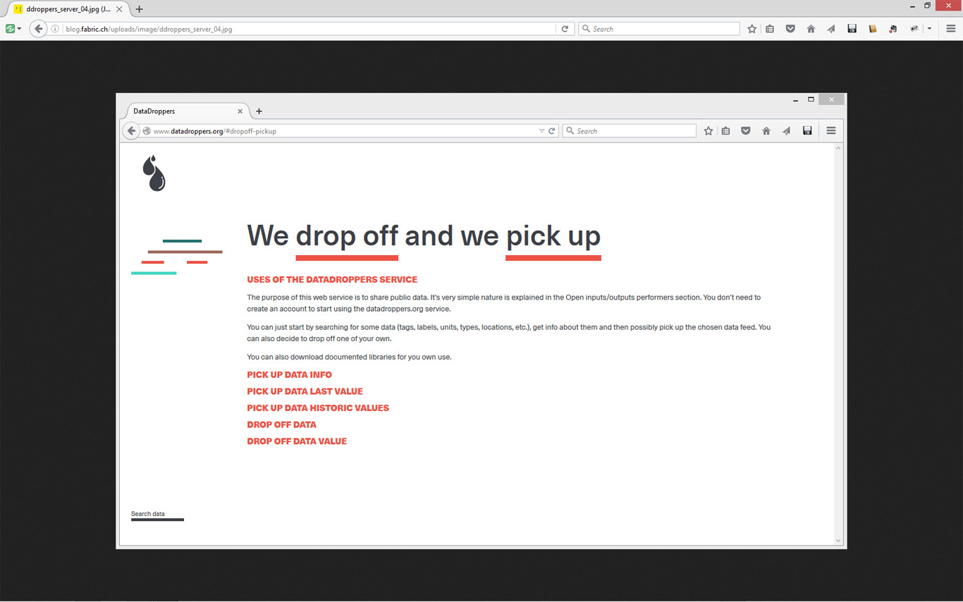
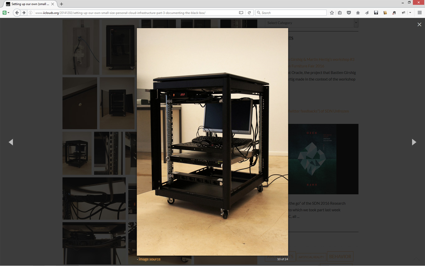
A preliminary Processing library for the open source cloud software OwnCloud that can already be downloaded from our blog, a public tool to declare and retrieve data (both top) and our current OwnCloud server — the cloud platform that we chose and set up to work with after considering several options — (bottom). These three technologies were developed or set up under the close supervision of Dr. Christian Babski from fabric | ch.
Images retrieved from the posts “Cookbook > How to set up Processing to use the OwnCloud Core Processing Library” (12.02.2015), “Datadroppers, a communal tool to drop off and/or pick up data” (10.10.2015), “Setting up our own (small size) personal cloud infrastructure” (02.12.2014).
…
It is therefore about the results of these workshops that we’ve sorted out and highlighted the following set of “Learnings“. They will guide us during the next and final phase of the joint design research Inhabiting & Interfacing the Cloud(s).
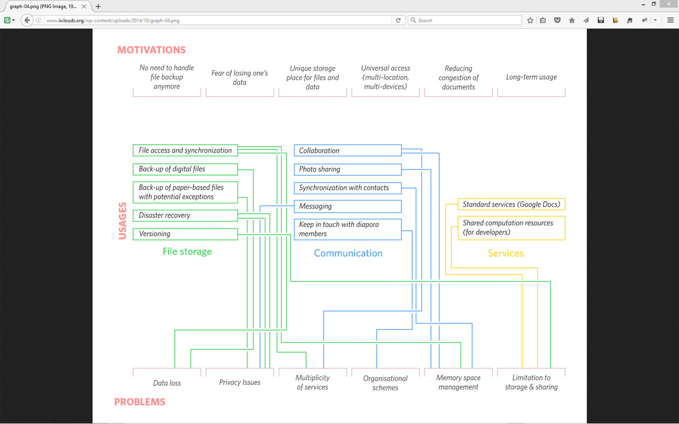
Preliminary learning: “motivations” vs. “problems” in the uses
Diagram of motivations, usages and problems in cloud applications by Nicolas Nova and Charles Chalas.
Retrieved from the post “I&IC workshop #1 at HEAD” (06.10.2014).
We’ve been following the ethnographic field research in parallel to our interaction design sketches (workshops). Especially its recent outcomes. Some of the findings are quite important for the next phase in the design process, in particular the way in which the “cloud experience” was identified, organized and described (diagram above): users usually choose to drop files in the cloud because a set of different “motivations” (i.e. it’s convenient, they are mobile persons and want to access their files anywhere, they are afraid of loosing their files or want to hide or encrypt them, they desire an universal access on all their devices, etc.)
It works quite well in general but sometimes “problems” occur (files are not synchronized, erased or lost, some are publicly published that shouldn’t, versions are overwritten, copies are in conflict, the person who shares your files decides to move them, etc.) These “problems” always appear to be an “immanent menace” to the fulfillment of the service and to the data it hosts, “dangers” that most users keep in mind almost unconsciously, when they are not directly confronted to them …
The difference between “motivations” and “problems” also points out to some “misunderstandings” about the way the service and technology supporting it are working, which can also be linked to the “invisibility” of the whole experience or its “camouflaged” nature, as observations pointed out.
We’ve noted though that these “misunderstandings” could be of great interests during the further and final design process, as they point out to an unaddressed “grey zone” that probably need treatment. We’ve also noticed the possibilities of using natural gestures to “incarnate” cloud functions (image below, Learning 4) during our workshops with the design students, or to develop services that wouldn’t be as generic as the default cloud.
Learning 1: the cloud is indeed a hard to grasp and difficult design question
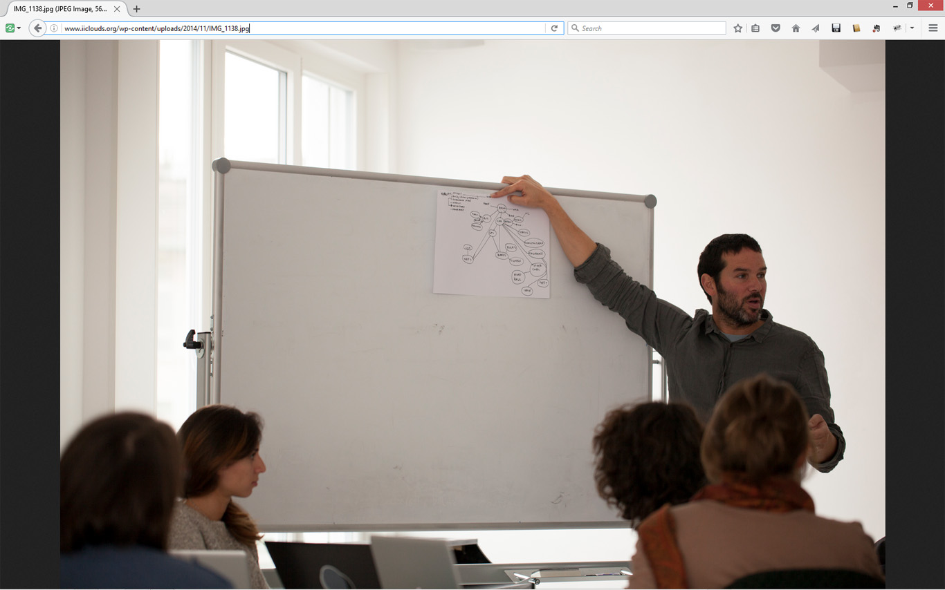
James Auger tries to map the presence and “location” of the cloud within a service during a workshop.
Image pulled from the post “I&IC workshop #2 with James Auger at HEAD” (04.11.2014).
This point didn’t really come as a surprise as we pointed out the necessity to develop tools and democratize the service and its understanding in the foundation document of this design research. The different experiences we led confirmed this hypothesis (both with end-users and with designers trying to develop personal works for the service).
In the continuity of workshop #2 (image above), Nicolas Nova and Charles Chalas even tried to further develop alternative cloud applications and design implications, just to confirm that this wouldn’t be a fruitful path for our research: it would mainly consist in creating different applications, drowned in an ocean of cloud applications and interfaces that wouldn’t address the technological apparatus in itself.
Yet, it seems almost impossible to address the cloud as a whole because it consists in a stack of services, sometimes distributed, even so often proprietary (and therefore paradoxically centralized as we pointed out, mainly for security and commercial reasons). It needs different skills to address this stack. It is therefore hard to understand it as an entity and address it in that manner. We observed an obvious lack of accessible tools and procedures for designers and makers at large that should be addressed.
This learning stresses the necessity to take on “The Cloud” from different perspectives (same question, different angles) in an interdisciplinary manner, which we did. Lacking to do so prohibit the possibility to propose strong alternatives (i.e. doing a different interface wouldn’t change the infrastructure).
Learning 2: invisibility of the service, the data and the infrastructure or misleading iconography (a camouflage)
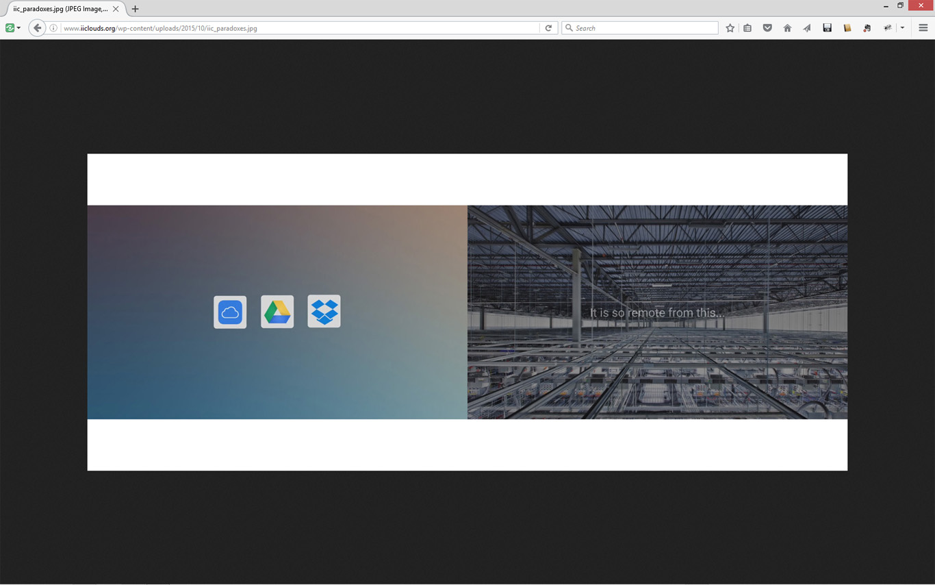
Two images side by side on a screenshot extracted from a video by Lucien Langton and the associated post “Inhabiting and Interfacing the Cloud(s), a design research teaser about misunderstandings and paradoxes …” (05.10.2015).
The chosen and planned invisibility of the cloud service and infrastructure, so as the data it holds reinforced the difficulty to grasp it. The reasons for this invisibility must be sought in the areas of security, of the real secrecy (industrial) or the apparent one (data) and the need for the versatility of the experience.
It has been revealed several times during our research: the absolute misleading iconography acts as a camouflage on the exact nature of the service and creates a huge gap between its representation and physical reality — the service is often represented as a single icon drowned into one’s Operating System (above image) –. This fact tends to keep “users” at a distance and contributes largely to the misunderstanding of the technology.
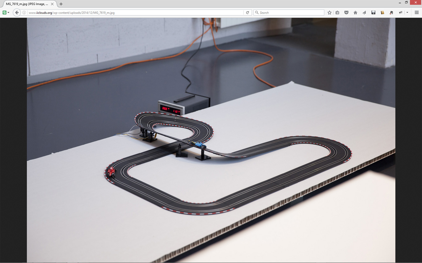
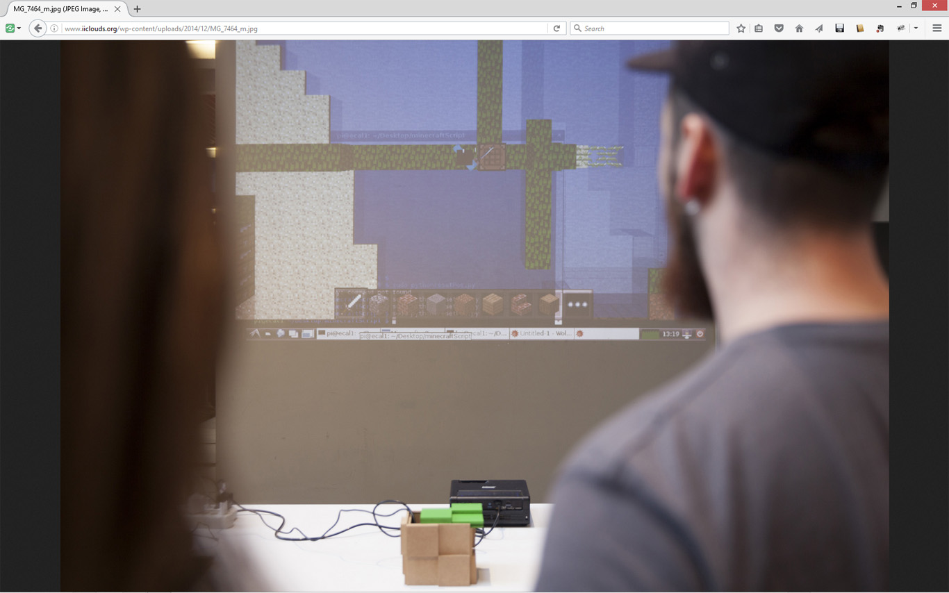
Data visualizations about the flow of data in cloud services that materialized as two cars racing against each other on the track of a child toy (top) and a bot that plays video game Minecraft according to data flows (bottom). Both from #Algopop workshop.
Pulled from the post “I&IC workshop #3 with Algopop at ECAL” (24.11.2014).
Interestingly, even so predictably and when confronted to the service, most design sketches that came out through the different workshops made use of data visualization of some sorts to represent either a process, a flow or some data content (by tangible –objects — or intangibles means –screens rather more likely than sounds–). It almost naturally appeared to be a necessity.
Learning 3: technological beliefs, (data) phantoms, irrationality
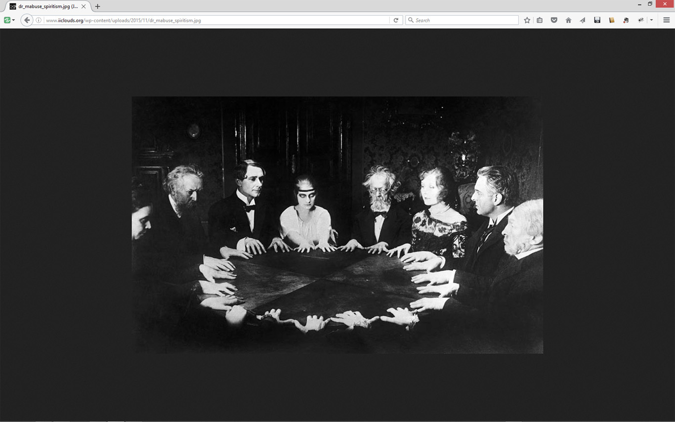
An illustration published prior to Random International workshop about “The Everlasting Shadow” and “Data Ghosts”. The image is taken out from a seance to contact the dead in the movie “Dr. Mabuse, the Gambler” by Fritz Lang, 1922.
Retrieved from the post “I&IC workshop #5 at ECAL: esoteric comments about the cloud” (11.11.2015).
Misunderstandings, invisibility and secrecy often lead to beliefs. It appears it doesn’t go differently with technology and especially that of the cloud, as this was regularly observed throughout the workshops we led and observations we made: a tendency for the whole experience to remain almost subliminal (some end users, half-joking, even spoke about their files going to be “stored in some sort of pyramids in Egypt” …)
This theme became the subject of a workshop where the design students taking part in the sketching process started to look for strange references when it came to design for such an engineered service and to access the data it holds: spiritism, (forgotten data) ghosts and other kind of irrational devices…
Learning 4: physical objects, (bots) and natural gestures as interfaces
A “networked data object” (wooden pig face that contains a Raspberry Pi) during Matthew Plummer-Fernandez workshop, or the “Internet of Things/Everything” as objectified interfaces for your cloud services.
Image retrieved from the post “I&IC workshop with Algopop at ECAL” (25.11.2014).
It could be almost perceived as a too direct answer about the “invisibility” and “immateriality” nature of the whole cloud experience: one of the key learning that came out from the design sketches about different ways to interact with “The Cloud” was to focus our efforts on networked objects rather than screens, to think of objects as interfaces to access files/data/processes/… A very specific Internet of Things therefore, accompanied with natural gestures or voice controls that could help “objectify” the hidden processes and actions.
This learning came out for different reasons, the most important one being obviously to give visibility and a possible understanding to the largely unseen, within this specific context.
Yet another important reason for this research that came out from the design workshops and discussions we led was that it became pretty clear that connected objects (IoT, IoE) would address fundamental questions to the future evolution of cloud infrastructures. There will simply be too many automated data creation once all these objects will be connected, to put it simply. A need will increasingly develop to treat and sort data locally, before “pushing” and “multiplying” the important ones into the large cloud.
The interesting fact is that this point was treated during Matthew Plummer-Fernandez workshop while experimenting at the same time around new types of object-interfaces integrating bots intelligence and automated local data treatment.
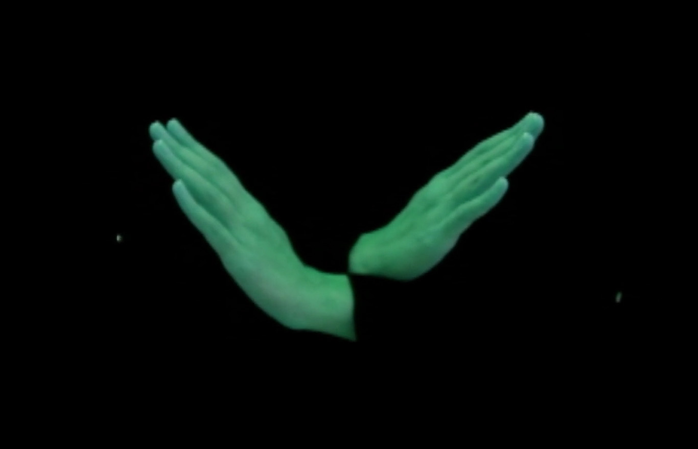
Taken out from the video about Sascha Pohflepp workshop, this image illustrates potential natural gestures that could incarnate cloud functions in a physical manner (i.e. block access to data in this exemple).
Image retrieved from the article “I&IC workshop #6 with Sascha Pohflepp at HEAD” (15.01.2016).
Following the same line of thinking, gestural interfaces inspired by observation and combined with physical objects could be more intuitive and help understand how things are working.
Learning 5: retrofitted domesticity instead of territory
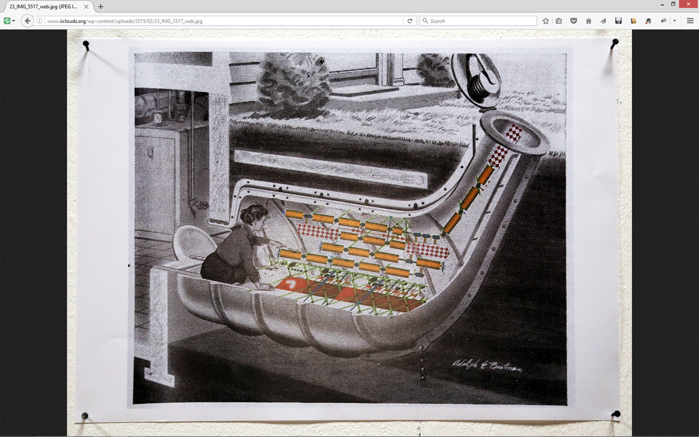
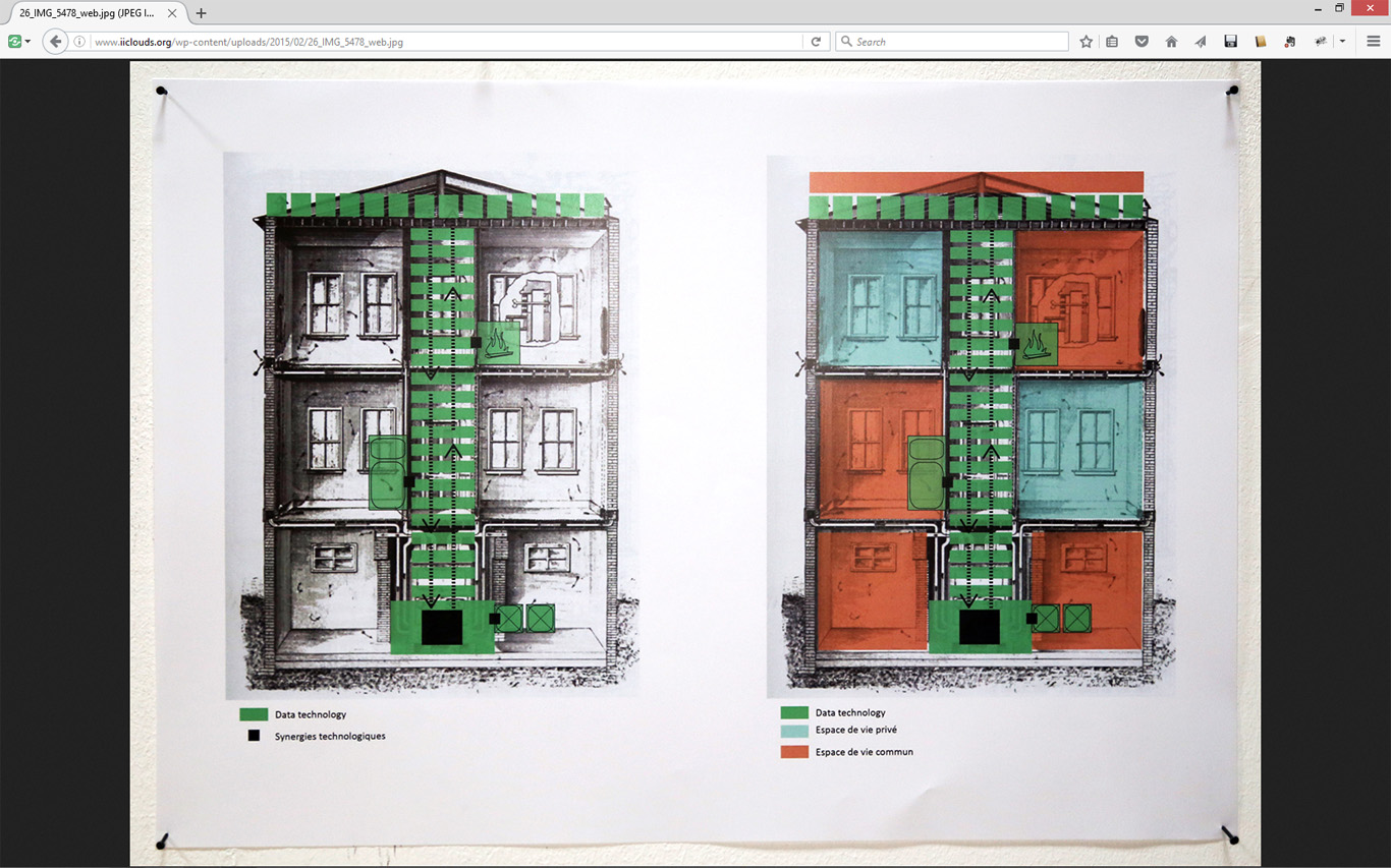
An illustration (top) as a wink from the workshop led by ALICE laboratory (EPFL) shows a kind of useless house appendix (part of a family nuclear bunker of the 50ies), retrofitted into a house domestic data center. Retrofitted apartments with cloud “devices” (bottom).
Illustration retrived from the article “I&IC workshop #4 with ALICE at EPFL-ECAL Lab” (09.02.2015).
The landscape approach revealed to be necessary and revealing, but pretty difficult to address in a concrete manner (because of a too large scale for interventions). But while the architect students looked to decentralize the infrastructure of the cloud and its data center, they also quickly focus their interests on small scale architectures and the possibility to retrofit obsolete, yet existing and already decentralized constructions.
They looked therefore at windmills, family bunkers (we have a lot of these in Switzerland), mountain chalets, etc. They looked as well at how they could possibly combine a fully distributed cloud infrastructure with elements of existing houses and flats (basements, air or water conducts, heaters, thick walls, etc.) that started to get quite closed to furnishing elements (air heaters, air dryers, bookcases, ) or even small “living structures/shelters” within interior or enclosed spaces (houses, flats, offices, etc.)
Based on these “Learnings”, we can underline four + one strong guidelines for future design developments:
- Our research team needs to continue thinking about simple tools, improved recommendations and possibly methodologies that will help gain access to resources about cloud technologies for a larger community, in particular designers and makers. For this we should pursue what has already been initiated at the beginning of our work when we set up our own platform.
- We shall create with these tools a “version” of the cloud (one or several “I&IC versions”) that would exemplify a less neutral interaction, yet in more comprehensive approaches that would “show” and objectify what is happening in the hidden pipes.
- To pursue the general goal of objectification widely requested through the conducted experiences and interviews, to design it and be consistent with our “Learnings”, we should mainly associate the visual developments of the project with data visualization (objectification of data, processes, fluxes, etc.) In parallel, a set of physical objects could durably incarnate in each user’s proximity the existence of its own or shared cloud files. These responsive physical objects could be associated or combined with natural gestures (objects to manipulate) to perform distant actions on these files and folders.
- To distribute an open, programmable and accessible cloud infrastructure, both soft and hard, we’ll need to retrofit or redesign the 19″ computer cabinet based on the “U” standard metric, so to host these elements. This could help move the “computer cabinet” out of the data center by transforming its language. If we think about distributed “home data centers”, “shelters” or “living structures” that would contribute to the objectives of physical, but also digital decentralization, then the 19″ computer cabinet must become a more domestic artifact.
+ one:
- All these “findings”, tools, methodologies, plans of artifacts, models, etc. should be clearly highlighted and freely accessible on one online platform.
