As we are now well into the second phase of Inhabiting & interfacing the Cloud(s), our aim is to materialize and verify our research. The intent is to work from two complementary perspectives: object design and interaction design. Lea Pereyre, object designer, and myself Lucien Langton, interaction designer and both assistants on the design research I&IC, will work on some parts of the physical hardware of the cloud as well as on it’s functions and usages.
Doing so, we are pursuing by design means the Learnings from the “I&IC design research wrap-up of sketches, towards artifacts” and “blabla”.
If the cloud as a medium has not yet been colonized by designers, expect of course in the applied case of user experience and interaction design practices, it is perhaps because it takes the place of a “blind spot” in our lives as front-end users. As soon as we make a gesture towards it’s nature it seems to vanish in a blur.
A first step in enabling designers to grasp the concept seems indeed to setup an enumeration of the building blocks composing the cloud. After all, it is a system of systems, optimized to perform certain tasks: upload, download, synchronize, share, compute, stream, and perhaps more. Many of them on third party hardware. The term “Cloud” is only a packaging for such terms, therefore it seems evident to investigate the possibility of a plurality of objects in order to create a relevant design for the somehow blurry term.
Moreover, the most flagrant incarnation of the cloud resides in it’s physical infrastructure. Colossal amounts of servers, electricity and cables are necessary to maintain this invisible yet crucial part of our contemporary society. This ecosystem built for machines to host and compute data is filled of objects, engineered in the never-ending quest for optimization: hubs, ventilators, connectors, etc. The most recognizable and useful object of this data paraphernalia is the 19″ server-rack. It is therefore natural to identify the server-rack as an obvious subject of product design in this research, especially also because it was “unblackboxed” almost at the beginning of this research.
The 19″ Server Rack and the “U” unit: object design
Historically, the invention of the 19″ server rack is a mystery. It was first standardized by Bell Telephone Company (later AT&T), but was probably introduced beforehand in the railway infrastructure. Anyhow, it has always been an object dependent of the technology it supports in it’s evolution. This strange object has constantly evolved through the quest for performance optimization in electronics but it was until recently never questioned in it’s mobility aspects, let alone in itself as a designed object. The cloud’s physical infrastructure is a hostile environment for humans, even though it is meant to provide end-users with an abundant set of resources.
This hostile hardware is defined by a peculiarly standardized characteristic:
- The unit U is specifically used to standardize server-rack heights and inner vertical spacings. One U is equivalent to 4.445 cm, or 1.75 inches.
This unit is of specific interest for our research as a formal constraint in object design. Other standards of interest were already introduced and documented in a previous post here.
It is necessary to acknowledge that these standards are maintained in order to keep in place a technological (and therefore economic) compatibility and interoperability within the infrastructure. It is difficult for non-technical users to gain access to the hardware necessary to setup their own infrastructure, precisely because the technical aspects aren’t communicated to encourage public use. This is why we need to re-appropriate these standards as designers with an open-source approach in mind. The first step towards this re-appropriation is to get familiar with the technical aspects of server-rack.
Considering the personal cloud as a paradigm serves primarily the need for users to store their “memory” (storage is by far the most popular function of the personal cloud), it is crucial to notice that by externalizing our “memory” to the cloud we have actually displaced it to distant data centers. In this regard, re-appropriation is also a way to become conscious of this phenomenon.
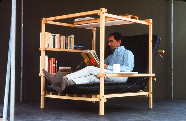
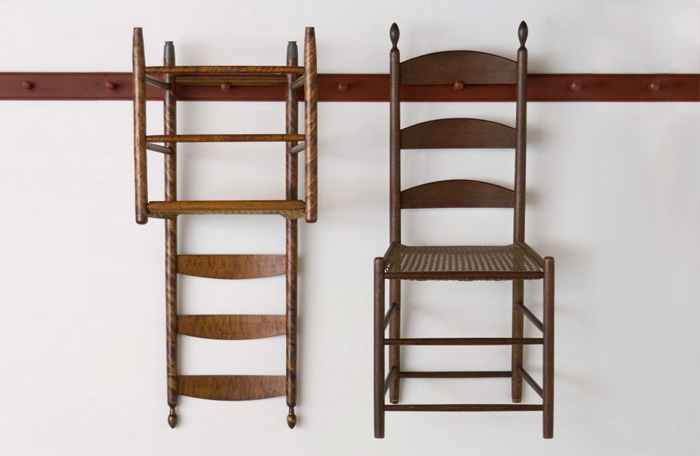
Two references (out of the datacenter field) were identified as interesting design tracks according to our research questions (didn’t we wonder in this document about inhabitable shelter/data center in the chapter “What is the most appropriate approach?”)
The first reference, then, is Living Structures, Ken Isaacs, 1974, in which the author investigates our daily domestic micro-environments and synthesizes modular counter-proposals under the form of an open-source manual. The second comes from Shaker furniture, in which the aim was to design a universe of objects which all share a common function: to optimize the surroundings in order to liberate space for spirituality.
Ken Isaacs, Super chair (top) and Shaker chairs (bottom).
The Functions: interaction design
As users, we often use the cloud without even knowing it. The reason for this is that the cloud is a system engineered to assure a constant access to data and other users regardless of their position on the planet. This goal to access everything whenever and from everywhere relies on key functions which are kept hidden (“blackboxed”) in the user’s experience. Therefore, our clouds, phones, computers and connected devices constantly upload, download, synchronize, compute, stream and share data in the background.
The closest way in which these functions exist for the users are in the form of buttons, icons & notifications in the user’s interface. We can see these actions are always triggered by the same user interactions: click, tap, swipe down to sync, scroll down to load more data (in essence download), etc. On one hand the user has an extremely restrained contact with these actions, but on the other hand an ever-increasing universe of connected objects embodies the granular appliances of these actions.
These connected objects, often referenced to as the “Internet of Things”, decline cloud functions under every form. These remain nevertheless opaque to the user’s eyes, which is once again a flagrant proof of the vacuous engagement in the design process to produce these objects.
Connected devices of the internet of things are often the only ambassadors of the cloud under tangible form. However, one cannot help to notice their aesthetic and interactive aspects are often disappointing. Indeed, these objects are only designed with the purpose to add market value to a technology, but very rarely does it question or reduce the system’s technical opacity. We believe designers have a strong responsibility in this.
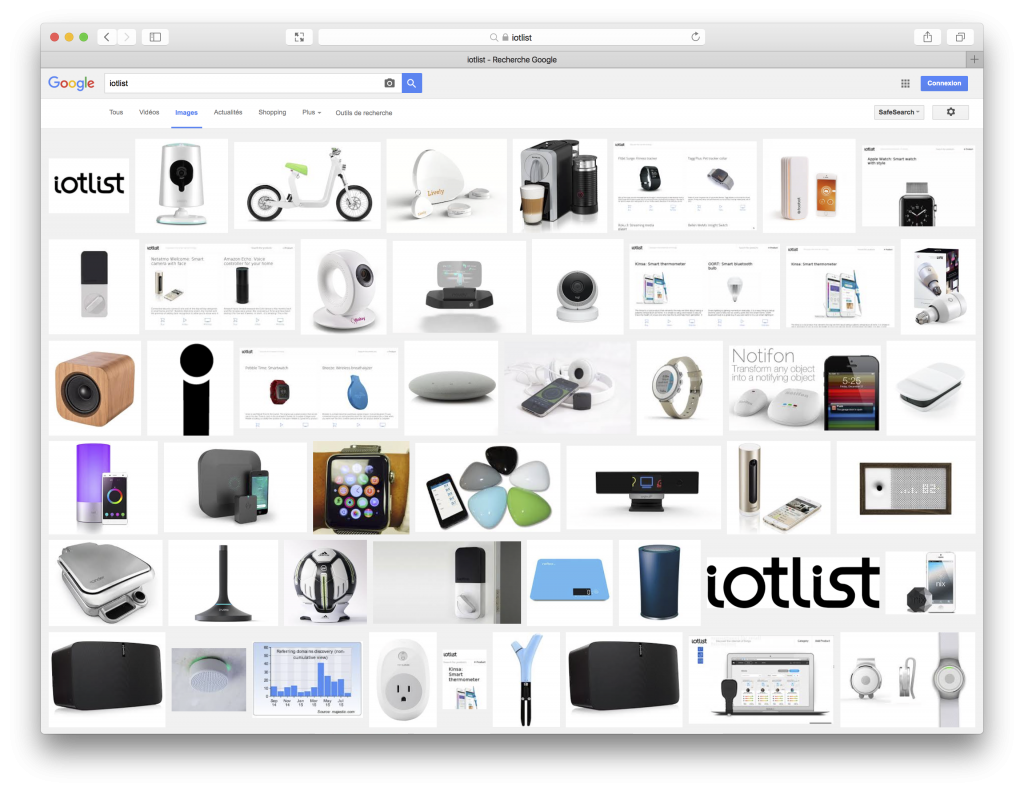
Iotlist entered as a search term in Google images gives a quick glimpse of the trend in connected object design.
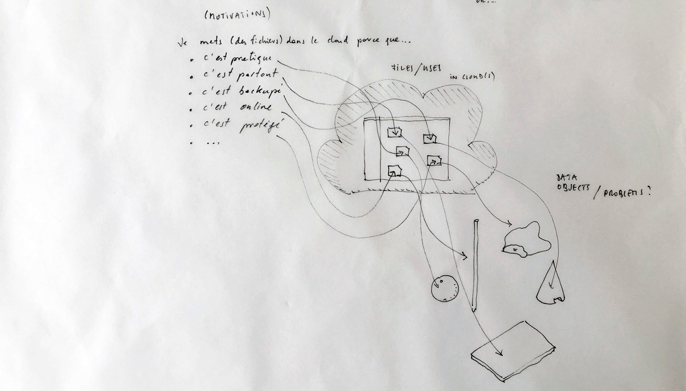
Designing a family of connected objects seems like a good lead at this stage, because it resolves several conceptual problems. First of all, it enables to kickstart a debate on the bundled nature of cloud functions. Dissecting the cloud into a list of functions is already a first step towards the establishment of an honest familiarity with the concept. In the second place, we need to give the cloud a body. One of the major difficulty with cloud computing is it’s invisibility. By embodying these functions we give place to commentary on each one of them.
Finally, objects are interesting in their different sizes and physicality. What would happen if instead of launching an upload with a click, it would be launched by temperature, location or proximity? What would happen if the object could be transported in a pocket? Or on the inverse, would be too heavy to move but very fragile? These are the tracks we are digging and interrogating at this stage in the research, enabling us to envision a personal family of objects related to the cloud.
